16 Jun Facebook and Twitter Design for Maximum Impact
Contributed Post: Irvin Krajisnik, Founder of IK Design.
It’s frustrating when I go to the Twitter or Facebook page of a great brand to find that it hasn’t been customized. Their Twitter avatar is still an egg and the background remains fluffy clouds. There is no attempt to project their brand identity through their social sites.
Here is the thing, it’s not difficult to pretty-up your social sites so that they appeal to even the most modest fans.
Setting up a Twitter, Facebook or LinkedIn page is all well and good, but imagine how much more impact you could have if you had the perfect avatar and background. After all, a picture’s worth a thousand words!
Twitter Avatar and Background
If you dabble in social media, chances are you have a Twitter account. Does your Twitter profile have a custom background and a custom avatar? It should. People researching your brand expect to see tastefully branded sites.
MailChimp does an excellent job of keeping its site, Twitter account and Facebook account cleanly branded with maximum impact.
Ask yourself this question: “What do I want current and potential customers to take away from viewing my Twitter page?” Whatever the answer may be, put it in your avatar and on your background. If you’ve got something to promote, get a background designed that clearly promotes your product. Don’t forget to include your website address.
The most effective way to promote your brand through Twitter is to include an image of your logo/product in the top left-hand corner of your Twitter background. The image should be followed by your website address and anything else you may want to include. Make sure that all of these elements are clear and visible. Be careful not to create too much clutter – keep it clean.
Tip: Include the links to your other social media accounts.
Taking these simple, but essential, steps could lead to more inquiries, which could lead to an increase in sales. Remember, always put yourself in the shoes of your target audience – try to relate to their needs. Finally, make it easy for them to act on your calls to action, whether they be to visit your website, check out a video or something entirely different.
Need some Twitter design specs? Check out this page for more info.
Facebook Welcome Pages
Another great way to discover and engage with fans is through Facebook. Duh! These days, everyone and their dog has a Facebook page, so why not use this to your advantage? [Literally, everyone and their dog. Heard of Boo? Check out his Facebook page.]
Often, when a customer lands on your Facebook page, they are looking for something specific – community size, interaction, a website address, a phone number or perhaps a map to your business location. However, did you know that you can also use Facebook as a landing page?
Basically, picture a landing page as a big funnel that channels traffic to wherever you want it to go. By designing a custom linked graphic to put on your main Facebook page, you could be directing traffic to your product or website much more efficiently. Text links are boring and don’t attract as much attention as a large graphic dedicated solely to promoting your brand does.
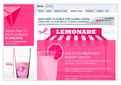
 Delta Airlines created a couple custom tabs to bring awareness to breast cancer. Their Facebook image directed visitors and fans to the “Global Good” tab. They gave up some prime social real estate for a greater good. Good on them!
So, the idea is to implement a professionally designed landing page that is going to compliment your brand in graphical form. Include a picture of your product, a prominent call to action and a creative theme. The possibilities here are endless.
Tip: These pages are perfect for capturing e-mails, advertising sales promotions and pushing traffic to your website.
Design in social marketing is extremely important. Your social media pages are an extension of your brand, so it’s important that these pages are styled and designed to reflect this. Remember to keep your branding consistent and clear, use colors and fonts that stand out, and whenever possible, give your customers an incentive to act on your calls to action.
Irvin Krajisnik is the owner of IK Design, a small design agency on the Gold Coast that specializes in web design, graphic design, company branding, and search engine optimisation. Irvin is an entrepreneur and digital artist that believes in creating awareness through social media regarding issues in today’s society, which is evident through his work with his startup, “BittyBay”. BittyBay is an online virtual animal world for kids that educates and inspires young people on the topics of environmental conservation and animal welfare.


No Comments